# 一.Radio
# index.ts
import Radio from './src/radio.vue'
import RadioButton from './src/radio-button.vue'
import RadioGroup from './src/radio-group.vue'

import type { App } from 'vue'
import type { SFCWithInstall } from '@element-plus/utils/types'

Radio.install = (app: App): void => {
 app.component(Radio.name, Radio)
 app.component(RadioButton.name, RadioButton)
 app.component(RadioGroup.name, RadioGroup)
}

Radio.RadioButton = RadioButton
Radio.RadioGroup = RadioGroup

const _Radio = Radio as any as SFCWithInstall<typeof Radio> & {
 RadioButton: typeof RadioButton
 RadioGroup: typeof RadioGroup
}

export default _Radio
export const ElRadio = _Radio
export const ElRadioGroup = RadioGroup
export const ElRadioButton = RadioButton

export * from './src/token'
1
2
3
4
5
6
7
8
9
10
11
12
13
14
15
16
17
18
19
20
21
22
23
24
25
26
27
2
3
4
5
6
7
8
9
10
11
12
13
14
15
16
17
18
19
20
21
22
23
24
25
26
27
# radio.vue
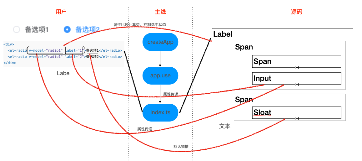
主要思路
从图中可以看出,radio 组件使用的流程
- 主线上通过 vue 将本组件注册到 vue 中
- 用户使用本组件,进行相关属性传递及事件操作
- 源码内部对,用户传递的属性/事件进行处理
- Radio Attributes
- model-value / v-model:属性传递,动态修改
- label:属性传递,作为本组件的一个标识与其他字段进行比较
- disabled:属性传递,通过样式控制
- border:属性传递,通过样式控制
- size:属性传递计算后,通过样式控制
- name:属性传递
- Radio Events
- change:数据发生变化内部向外部发送最新数据
简化后的代码
<template>
  <label
    class="el-radio"
    :class="{
      [`el-radio--${radioSize || ''}`]: radioSize,
      'is-disabled': isDisabled,
      'is-focus': focus,
      'is-bordered': border,
      'is-checked': model === label,
    }"
    role="radio"
    @keydown.space.stop.prevent="model = isDisabled ? model : label"
  >
    <span
      class="el-radio__input"
      :class="{
        'is-disabled': isDisabled,
        'is-checked': model === label,
      }"
    >
      <span class="el-radio__inner"></span>
      <input
        ref="radioRef"
        v-model="model"
        class="el-radio__original"
        :value="label"
        type="radio"
        aria-hidden="true"
        :name="name"
        :disabled="isDisabled"
        tabindex="-1"
        @focus="focus = true"
        @blur="focus = false"
        @change="handleChange"
      />
    </span>
    <span class="el-radio__label" @keydown.stop>
      <slot>
        {{ label }}
      </slot>
    </span>
  </label>
</template>

<script lang="ts">
import { defineComponent, computed, nextTick, ref } from 'vue'
import { UPDATE_MODEL_EVENT } from '@element-plus/utils/constants'
import { isValidComponentSize } from '@element-plus/utils/validators'
import { useRadio, useRadioAttrs } from './useRadio'

import type { PropType } from 'vue'
import type { ComponentSize } from '@element-plus/utils/types'

export default defineComponent({
 name: 'ElRadio',
 componentName: 'ElRadio',
 props: {
   modelValue: {},
   label: {},
   disabled: Boolean,
   name: {},
   border: Boolean,
   size: {},
 },
 setup(props, ctx) {
   const { isGroup, radioGroup, elFormItemSize, ELEMENT, focus, elForm } =
     useRadio()

   const radioRef = ref<HTMLInputElement>()
   const model = computed<string | number | boolean>({
     get() {
       return isGroup.value ? radioGroup.modelValue : props.modelValue
     },
     set(val) {
       if (isGroup.value) {
         radioGroup.changeEvent(val)
       } else {
         ctx.emit(UPDATE_MODEL_EVENT, val)
       }
       radioRef.value.checked = props.modelValue === props.label
     },
   })

   const { tabIndex, isDisabled } = useRadioAttrs(props, {
     isGroup,
     radioGroup,
     elForm,
     model,
   })

   const radioSize = computed(() => {
     const temRadioSize = props.size || elFormItemSize.value || ELEMENT.size
     return isGroup.value
       ? radioGroup.radioGroupSize || temRadioSize
       : temRadioSize
   })

   function handleChange() {
     nextTick(() => {
       ctx.emit('change', model.value)
     })
   }

   return {
     focus,
     isGroup,
     isDisabled,
     model,
     tabIndex,
     radioSize,
     handleChange,
     radioRef,
   }
 },
})
</script>
1
2
3
4
5
6
7
8
9
10
11
12
13
14
15
16
17
18
19
20
21
22
23
24
25
26
27
28
29
30
31
32
33
34
35
36
37
38
39
40
41
42
43
44
45
46
47
48
49
50
51
52
53
54
55
56
57
58
59
60
61
62
63
64
65
66
67
68
69
70
71
72
73
74
75
76
77
78
79
80
81
82
83
84
85
86
87
88
89
90
91
92
93
94
95
96
97
98
99
100
101
102
103
104
105
106
107
108
109
110
111
112
113
114
115
116
# radio-button.vue
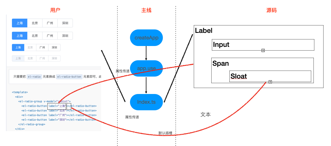
主要思路
从图中可以看出,radio 组件使用的流程
- radio-button 作为 radio-group 的插槽使用
- 源码内部对,用户传递的属性/事件进行处理
Radio-button Attributes
- label
- disabled
- name
简化后的代码
<template>
  <label
    class="el-radio-button"
    :class="[
      size ? 'el-radio-button--' + size : '',
      {
        'is-active': value === label,
        'is-disabled': isDisabled,
        'is-focus': focus,
      },
    ]"
    role="radio"
    :aria-checked="value === label"
    :aria-disabled="isDisabled"
    :tabindex="tabIndex"
    @keydown.space.stop.prevent="value = isDisabled ? value : label"
  >
    <input
      ref="radioRef"
      v-model="value"
      class="el-radio-button__original-radio"
      :value="label"
      type="radio"
      :name="name"
      :disabled="isDisabled"
      tabindex="-1"
      @focus="focus = true"
      @blur="focus = false"
    />
    <span
      class="el-radio-button__inner"
      :style="value === label ? activeStyle : null"
      @keydown.stop
    >
      <slot>
        {{ label }}
      </slot>
    </span>
  </label>
</template>
<script lang="ts">
import { computed, defineComponent, ref } from "vue"
import { useRadio, useRadioAttrs } from "./useRadio"

export default defineComponent({
  name: "ElRadioButton",

  props: {
    label: {
      type: [String, Number, Boolean],
      default: "",
    },
    disabled: Boolean,
    name: {
      type: String,
      default: "",
    },
  },
  setup(props) {
    const {
      isGroup,
      radioGroup,
      elFormItemSize,
      ELEMENT,
      focus,
      elForm,
    } = useRadio()

    const size = computed(() => {
      return radioGroup.radioGroupSize || elFormItemSize.value || ELEMENT.size
    })

    const radioRef = ref<HTMLInputElement>()

    const value = computed<boolean | string | number>({
      get() {
        return radioGroup.modelValue
      },
      set(value) {
        radioGroup.changeEvent(value)

        radioRef.value.checked = radioGroup.modelValue === props.label
      },
    })

    const { isDisabled, tabIndex } = useRadioAttrs(props, {
      model: value,
      elForm,
      radioGroup,
      isGroup,
    })

    const activeStyle = computed(() => {
      return {
        backgroundColor: radioGroup.fill || "",
        borderColor: radioGroup.fill || "",
        boxShadow: radioGroup.fill ? `-1px 0 0 0 ${radioGroup.fill}` : "",
        color: radioGroup.textColor || "",
      }
    })

    return {
      isGroup,
      size,
      isDisabled,
      tabIndex,
      value,
      focus,
      activeStyle,
      radioRef,
    }
  },
})
</script>
1
2
3
4
5
6
7
8
9
10
11
12
13
14
15
16
17
18
19
20
21
22
23
24
25
26
27
28
29
30
31
32
33
34
35
36
37
38
39
40
41
42
43
44
45
46
47
48
49
50
51
52
53
54
55
56
57
58
59
60
61
62
63
64
65
66
67
68
69
70
71
72
73
74
75
76
77
78
79
80
81
82
83
84
85
86
87
88
89
90
91
92
93
94
95
96
97
98
99
100
101
102
103
104
105
106
107
108
109
110
111
112
113
114
# radio-group.vue
Radio-group Attributes
- model-value / v-model
- size
- disabled
- text-color
- fill
Radio-group Events
- change
简化后的代码
<template>
  <div
    ref="radioGroup"
    class="el-radio-group"
    role="radiogroup"
    @keydown="handleKeydown"
  >
    <slot></slot>
  </div>
</template>

<script lang="ts">
import {
  defineComponent,
  nextTick,
  computed,
  provide,
  onMounted,
  inject,
  ref,
  reactive,
  toRefs,
  watch,
} from 'vue'
import { EVENT_CODE } from '@element-plus/utils/aria'
import { UPDATE_MODEL_EVENT } from '@element-plus/utils/constants'
import { isValidComponentSize } from '@element-plus/utils/validators'
import { elFormItemKey } from '@element-plus/tokens'
import radioGroupKey from './token'

import type { PropType } from 'vue'
import type { ElFormItemContext } from '@element-plus/tokens'
import type { ComponentSize } from '@element-plus/utils/types'

export default defineComponent({
  name: 'ElRadioGroup',

  componentName: 'ElRadioGroup',

  props: {
    modelValue: {
      type: [String, Number, Boolean],
      default: '',
    },
    size: {
      type: String as PropType<ComponentSize>,
      validator: isValidComponentSize,
    },
    fill: {
      type: String,
      default: '',
    },
    textColor: {
      type: String,
      default: '',
    },
    disabled: Boolean,
  },

  emits: [UPDATE_MODEL_EVENT, 'change'],

  setup(props, ctx) {
    const radioGroup = ref(null)

    const elFormItem = inject(elFormItemKey, {} as ElFormItemContext)

    const radioGroupSize = computed<ComponentSize>(() => {
      return props.size || elFormItem.size
    })

    // methods
    const changeEvent = (value) => {
      ctx.emit(UPDATE_MODEL_EVENT, value)
      nextTick(() => {
        ctx.emit('change', value)
      })
    }

    provide(
      radioGroupKey,
      reactive({
        name: 'ElRadioGroup',
        ...toRefs(props),
        radioGroupSize,
        changeEvent,
      } as any)
    )

    watch(
      () => props.modelValue,
      (val) => {
        elFormItem.formItemMitt?.emit('el.form.change', [val])
      }
    )

    const handleKeydown = (e) => {
      // 左右上下按键 可以在radio组内切换不同选项
      const target = e.target
      const className =
        target.nodeName === 'INPUT' ? '[type=radio]' : '[role=radio]'
      const radios = radioGroup.value.querySelectorAll(className)
      const length = radios.length
      const index = Array.from(radios).indexOf(target)
      const roleRadios = radioGroup.value.querySelectorAll('[role=radio]')
      let nextIndex = null
      switch (e.code) {
        case EVENT_CODE.left:
        case EVENT_CODE.up:
          e.stopPropagation()
          e.preventDefault()
          nextIndex = index === 0 ? length - 1 : index - 1
          break
        case EVENT_CODE.right:
        case EVENT_CODE.down:
          e.stopPropagation()
          e.preventDefault()
          nextIndex = index === length - 1 ? 0 : index + 1
          break
        default:
          break
      }
      if (nextIndex === null) return
      roleRadios[nextIndex].click()
      roleRadios[nextIndex].focus()
    }

    onMounted(() => {
      const radios = radioGroup.value.querySelectorAll('[type=radio]')
      const firstLabel = radios[0]
      if (
        !Array.from(radios).some((radio: HTMLInputElement) => radio.checked) &&
        firstLabel
      ) {
        firstLabel.tabIndex = 0
      }
    })
    return {
      handleKeydown,
      radioGroupSize,
      radioGroup,
    }
  },
})
</script>
1
2
3
4
5
6
7
8
9
10
11
12
13
14
15
16
17
18
19
20
21
22
23
24
25
26
27
28
29
30
31
32
33
34
35
36
37
38
39
40
41
42
43
44
45
46
47
48
49
50
51
52
53
54
55
56
57
58
59
60
61
62
63
64
65
66
67
68
69
70
71
72
73
74
75
76
77
78
79
80
81
82
83
84
85
86
87
88
89
90
91
92
93
94
95
96
97
98
99
100
101
102
103
104
105
106
107
108
109
110
111
112
113
114
115
116
117
118
119
120
121
122
123
124
125
126
127
128
129
130
131
132
133
134
135
136
137
138
139
140
141
142
143
144
# useRadio.ts
import { ref, computed, inject } from 'vue'
import { elFormKey, elFormItemKey } from '@element-plus/tokens'
import { useGlobalConfig } from '@element-plus/utils/util'
import radioGroupKey from './token'

import type { ComputedRef, WritableComputedRef } from 'vue'
import type { ElFormContext, ElFormItemContext } from '@element-plus/tokens'
import type { RadioGroupContext } from './token'

export const useRadio = () => {
  const ELEMENT = useGlobalConfig()
  const elForm = inject(elFormKey, {} as ElFormContext)
  const elFormItem = inject(elFormItemKey, {} as ElFormItemContext)
  const radioGroup = inject(radioGroupKey, {} as RadioGroupContext)
  const focus = ref(false)
  const isGroup = computed(() => radioGroup?.name === 'ElRadioGroup')
  const elFormItemSize = computed(() => elFormItem.size || ELEMENT.size)

  return {
    isGroup,
    focus,
    radioGroup,
    elForm,
    ELEMENT,
    elFormItemSize,
  }
}

interface IUseRadioAttrsProps {
  disabled?: boolean
  label: string | number | boolean
}

interface IUseRadioAttrsState {
  isGroup: ComputedRef<boolean>
  radioGroup: RadioGroupContext
  elForm: ElFormContext
  model: WritableComputedRef<string | number | boolean>
}

export const useRadioAttrs = (
  props: IUseRadioAttrsProps,
  { isGroup, radioGroup, elForm, model }: IUseRadioAttrsState
) => {
  const isDisabled = computed(() => {
    return isGroup.value
      ? radioGroup.disabled || props.disabled || elForm.disabled
      : props.disabled || elForm.disabled
  })

  const tabIndex = computed(() => {
    return isDisabled.value || (isGroup.value && model.value !== props.label)
      ? -1
      : 0
  })

  return {
    isDisabled,
    tabIndex,
  }
}
1
2
3
4
5
6
7
8
9
10
11
12
13
14
15
16
17
18
19
20
21
22
23
24
25
26
27
28
29
30
31
32
33
34
35
36
37
38
39
40
41
42
43
44
45
46
47
48
49
50
51
52
53
54
55
56
57
58
59
60
61
2
3
4
5
6
7
8
9
10
11
12
13
14
15
16
17
18
19
20
21
22
23
24
25
26
27
28
29
30
31
32
33
34
35
36
37
38
39
40
41
42
43
44
45
46
47
48
49
50
51
52
53
54
55
56
57
58
59
60
61
# token.ts
import type { InjectionKey } from 'vue'
import type { ComponentSize } from '@element-plus/utils/types'

type IModelType = boolean | string | number

export interface RadioGroupContext {
  name: 'ElRadioGroup'
  modelValue: IModelType
  fill: string
  textColor: string
  disabled: boolean
  size: ComponentSize
  radioGroupSize: ComponentSize
  changeEvent: (val: IModelType) => void
}

const radioGroupKey: InjectionKey<RadioGroupContext> = 'RadioGroup' as any

export default radioGroupKey
1
2
3
4
5
6
7
8
9
10
11
12
13
14
15
16
17
18
19
2
3
4
5
6
7
8
9
10
11
12
13
14
15
16
17
18
19
← 一.Cascader 二.Checkbox →